


Question:
How might we personalise news for the users so that it only suggest articles that they’re interested in ?
User:
Occupation: Full-time
Age: 26 to 34 years old
Description: Avid-phone user, reads news in Facebook because it filters out what he likes to read; recommends article that matches with his previous reads.
01 Prototype:
-
+
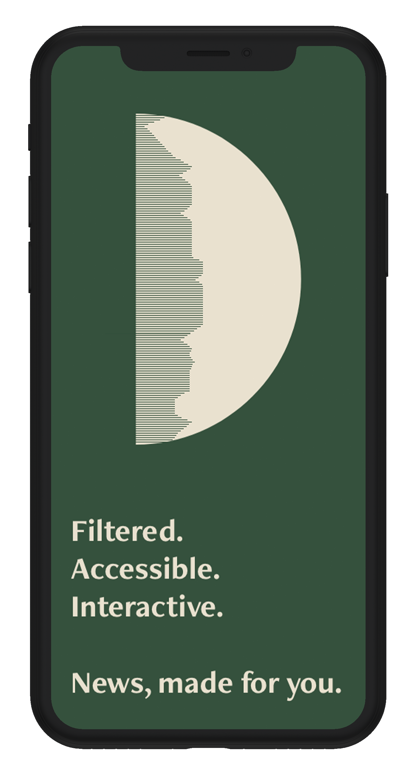
The very first prototype made so it’s rushed and basic but it gets straight to the point and meets the goal.
-
Since it’s basic, there are no microinteractions present so it’s not very engaging. My user described it as “rigid” with its basic functions that are too cluttered for his liking. For a news that aims to be “simplified”, the profiling process does not meet this.
-
- Since it’s a news platform, not much info is needed from the user. A simple email, password and name suffice.
- There’s also no need for a profile page.
- Listed topics is too cluttered and unengaging.
-
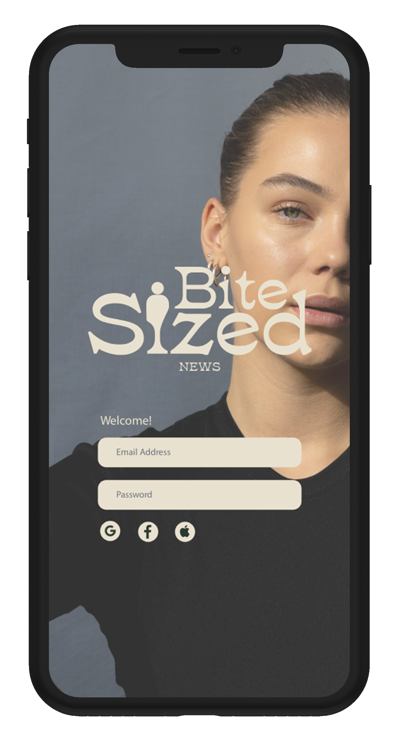
Flexibility and Efficiency of Use: user mentioned not having the usual choice of signing up through Google, Facebook or Apple which is much more easier and faster.
02 Prototype:
-
+
Using one of my ideation for the homepage combining both “welcome” and “sign-up” page to minimise pages, the user said that it became more straightforward compared to the first one. The added feature to sign-up using Google, Facebook or Apple as per recommended was also a bonus as it made it easier for the user to sign-up faster. Another positive is the added interaction for swiping in “cards” to browse the news in different category.
-
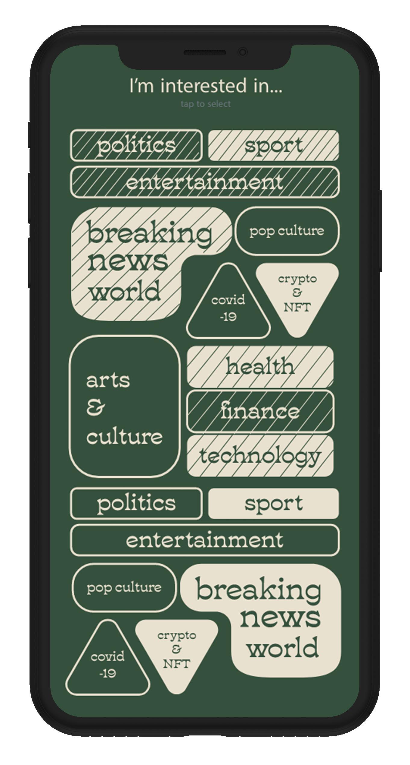
The”pick-a-topic” page is a bit tricky to use as the user needs to think aboutkeywords and topics instead of getting recommendation as to what they might like with an exception of the little rectangle “buttons” at the top of the type box that will recommend the most popular ones which is hard to know through a low-fi prototype.
-
- Remove the typebox for picking a topic, as it becomes challenging for the user to use.
-
Recognition rather than Recall: doesn’t minimise the user’s memory load as it doesn’t clearly present options for topics rather they have to think for it.
03 Prototype:
-
+
The added microinteractions at the bottom such as a pop-up loading screen and expanding box to present more options are engaging and “fun” to use. This prototype combined both ideas and recommendations from the last two which meets the goal of this app much better. The user also liked the home or logo page instead of the combined one because of the “loading” pop-up and as well as making it feel like the user is being welcomed instead of having the sign-up in the home page as it can be “in your face” too much.
-
Topics page might be too cluttered depending on how colour is used and the lines as well.
-
Aesthetic and Minimalist Design: use of design principles such as opacity for both “pick a topic” and “topics” page to showcase hierarchy which will make it easier for the user to know which part is highlighted and most important. The expansion of the bounding box to show more texts makes it easier for the user to only see what needs to be seen at the moment minimising information.

User:
Occupation: Full-time
Age: 26 to 34 years old
Description: Avid-phone user, reads news in Facebook because it filters out what he likes to read; recommends article that matches with his previous reads.
Question:
How might we simplify news reading by filtering out unnecessary information so that users can be up-to-date in a short amount of time they can spare?
01 Prototype:
-
+
The scrolling function makes it more engaging for the user to browse and makes the news accessible in one place for them as they can see the topic and a little description of what they might read therefore they can pick easily. Whilst creating this prototype, I unknowingly put in a location button so that users can choose where they want to focus their news in which my user really liked. He mentioned that its a great filter button making it easier to categorise news by location.
-
Again, the very first prototype made so it’s simple especially seen on the “read” page as it’s just standard scrolling page with a picture and texts not really simplifying the process for users.
-
- Think of ways the reading page can be more engaging and different from your competitors.
- Minimise block of words; SIMPLIFY
-
Recognition rather than Recall: user tapped the boxes for the news instead of scrolling through the right to browse more options. This could be the limitations of low-fi prototype?
02 Prototype:
-
+
The news browsing shows the topic and description, previewing the news with an aim that the user don’t have to click in order to know what it’s about. The user liked this feature as it makes it easy to filter out what he wants to read or not. The reading page being interactive with it’s swipe left feature with little texts instead of a block to simplify what the users will see each page.
-
Even though the user knows that they can scroll to browse more news, he tapped instead of swiping left on the reading page as confused with the arrow.
-
- Better way to feature the functions such as swipe left/right or up/down as well as tapping so the user knows what they need to do.
03 Prototype:
-
+
User aware that they need to scroll in order to browse more news, this could be because of the previous prototypes already tested.
-
The reading page is again not interactive, although the design is pretty there’s no functionality. User is not engaged, he looked and knew it was to read the news but nothing different. Again with the block text I aim to minimise.
04 Prototype:
-
+
This browsing page is the user’s favourite out of everything, because of the shape of the elements, he was aware that when he press the title, it will pop up the reading with the same shape. The scrolling function was also done successfuly and the user was aware.
-
Standard reading page again; block texting present. This reading page aims to condense all the informaiton in one page which might lead to too much information in a page disputing the aim to simplify.
05 Prototype:

-
+
User liked that they can see what the topic is about in one glance because of the topic title and mini description it presents. Interactivity because of the swipe left/right. Since it’s low-fi prototype it limits the way it tells the user what action they can do, but this gives me an idea on what I need to add when creating the app later on such as; a pop-up instructions of what they need to do. User also liked the graphics and small texts that comes with it as it helps him focus on information bit by bit and engages him to want to read more.
-
User confused with the browsing section as it seems like the app had picked what he needs to read already. But the positive disputes this (read above). He was also confused with whether he needs to swipe or scroll.
User:
Occupation: Student
Age: 18 to 24 years old
Description: avid social media user, avid phone user, only reads news when she sees a topic being talked about a lot in social media, wants to be more informed about the world
Question:
How might we keep users engaged and make news both educational and interactive for users that are intimidated by it?
01 Prototype:
-
+
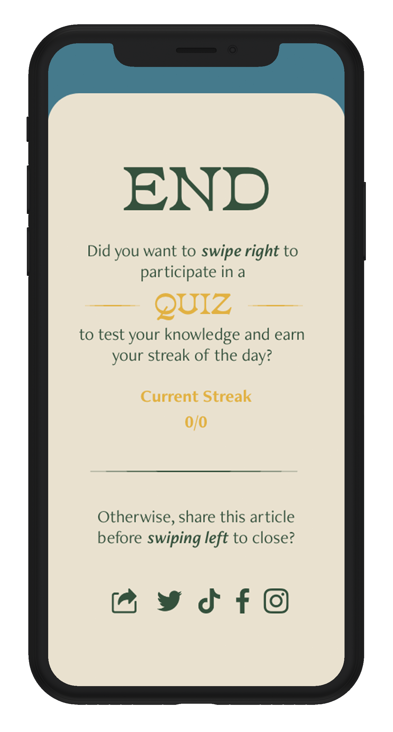
My user loves that this news app motivates users to check in and keep up to date through interactivity like quizzes (and potentially mini games) about the articles they read. It keeps a streak of how many times in a week you check the app. User also loves the summary of what they read in the day which also gives me an idea to put a wishlist on what they want to read and add it in this page so they can go back to it and tick it when they finished reading.
-
Limitations to this motivation is what reward will the user get when they reach a certain level? What will keep them motivated? Also have to think about an option for people who doesn’t want to participate in the quiz? Pressure on them might discourage them to use the app.
-
- wishlist page or add it in the calendar feature
- summary of the article in dot points after the quiz; their answers
-
Match between System and the Real World: questions in the quiz needs to be understandable without being too complicated and hard. It aims to retain information and educate the users.

Homepage
Welcome
Sign-up / Log-in
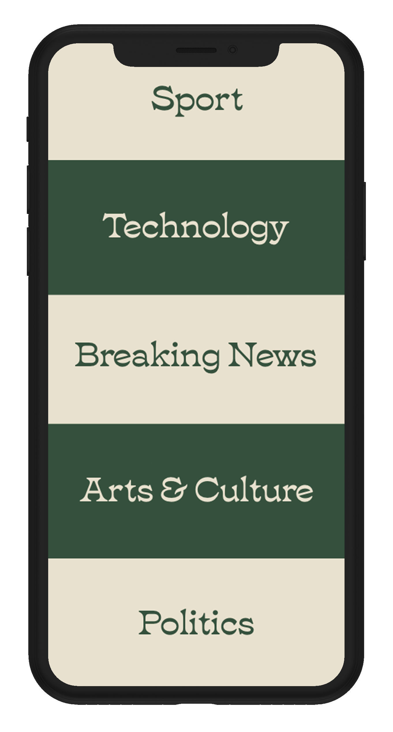
Topics
Chosen Topics
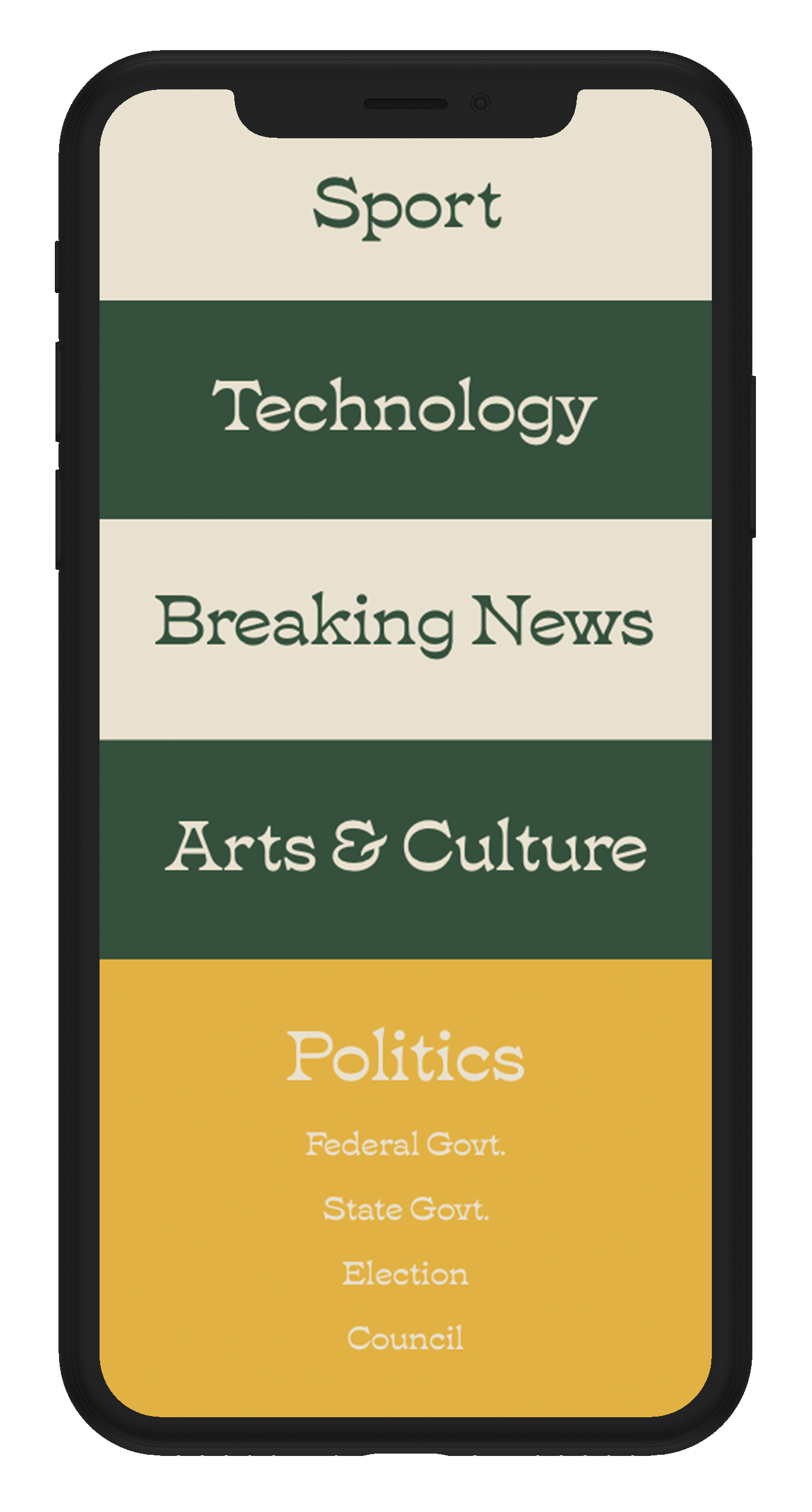
Chosen Topics Expanded
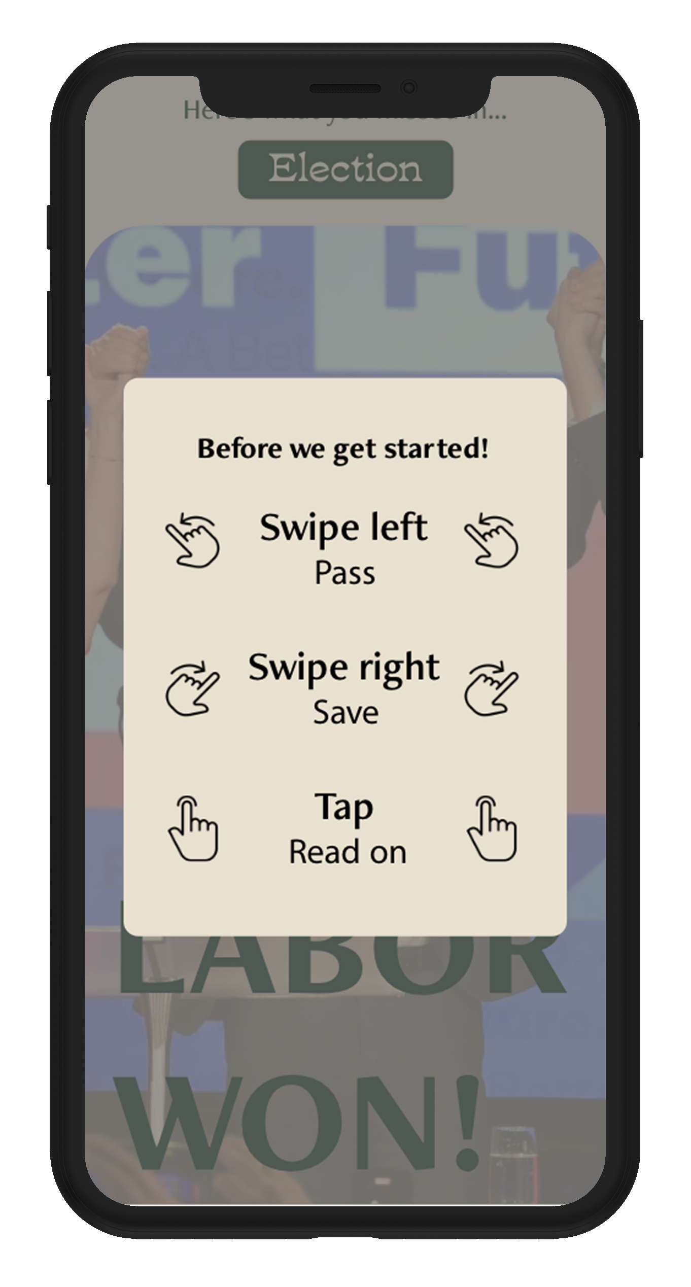
Instructions
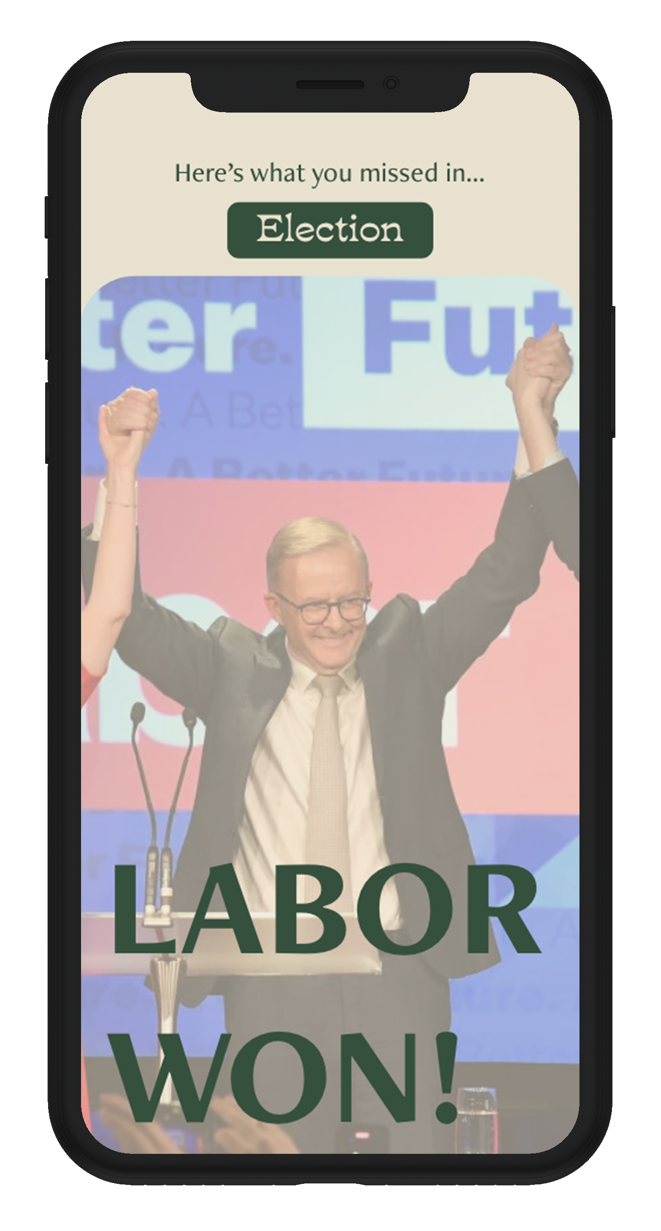
News One
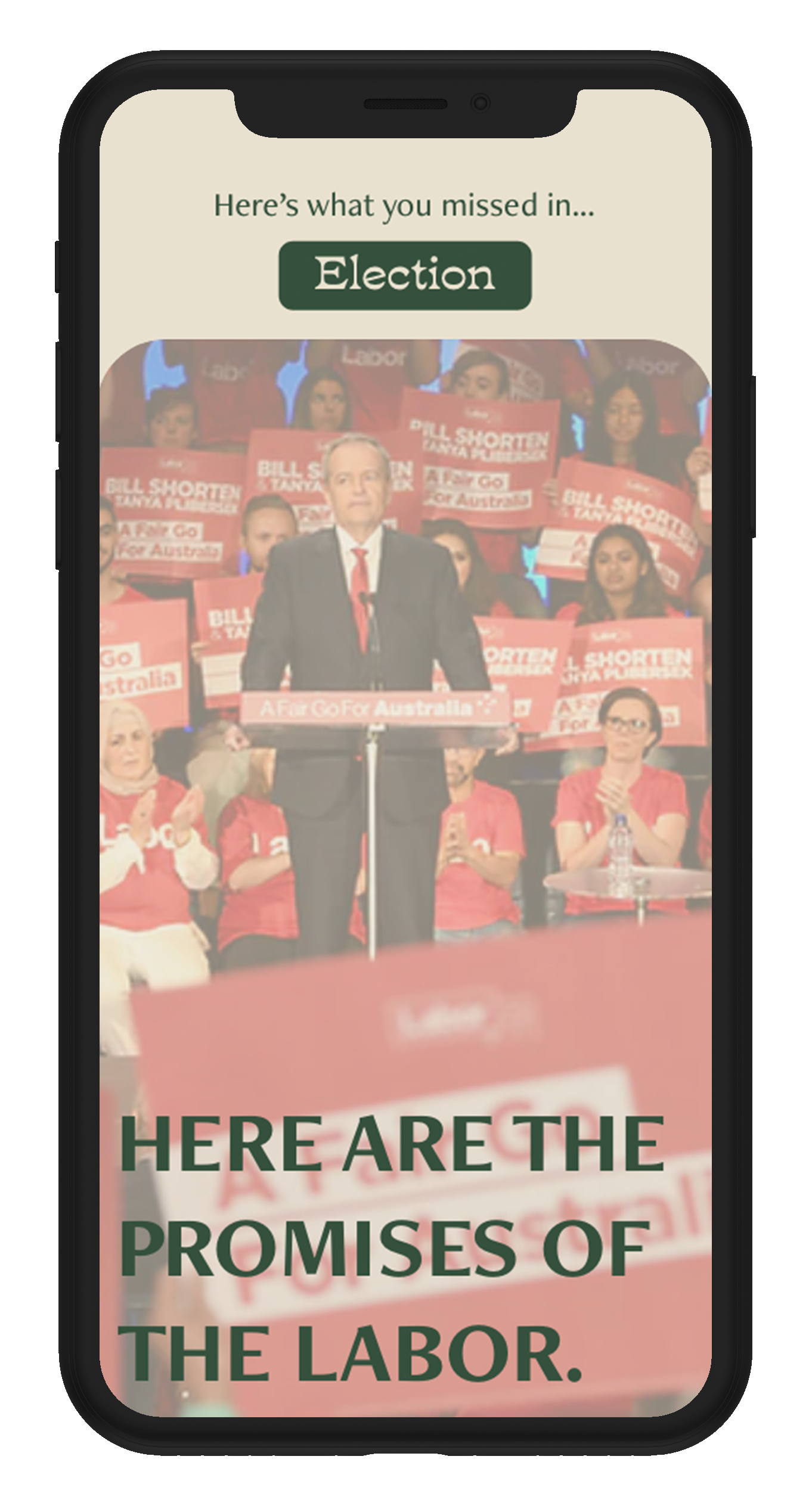
News Two
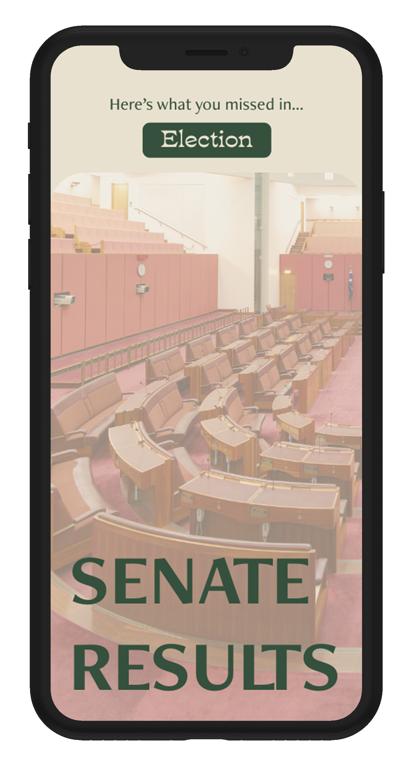
News Three
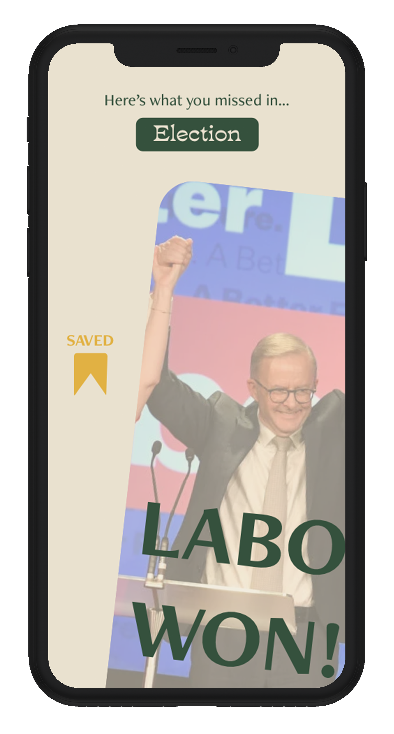
Task: Saved News
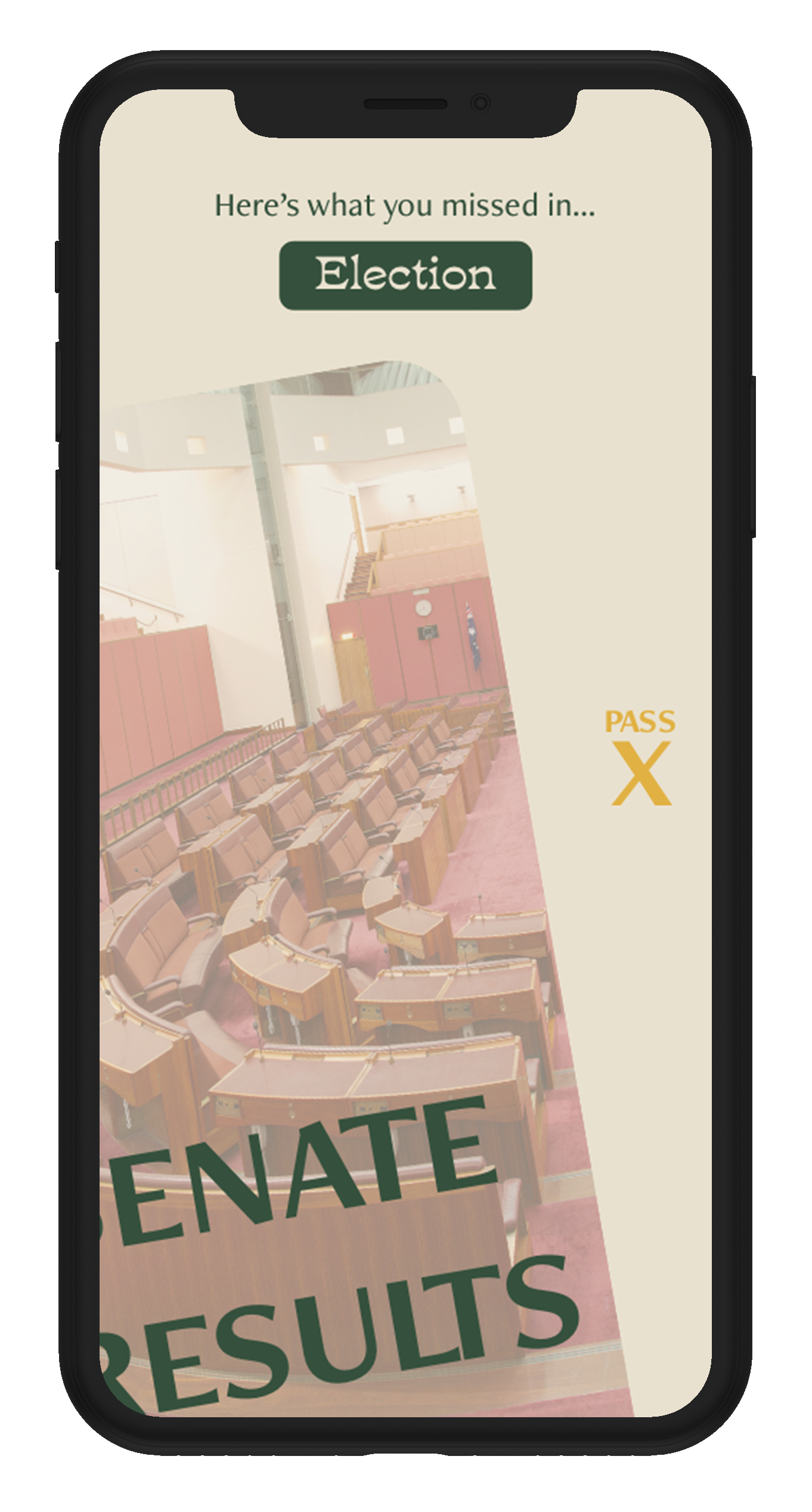
Task: Pass
Task: Chosen NEws
First page of the content
Second page of the content
Third page of the content
Fourth page of the content
Fifth page of the content
Quiz from the news
Quiz One
Quiz Two